Showing posts with label Resources. Show all posts

January 1, 2013

Cool and useful photo editing apps for photography


Whether you are a professional photographer or an occasional snapper, there are lots of apps which help you to edit your photos that you have captured. There are many apps through which you can edit your photo in a desired way just by one click. You can modify your friends’ photos in odd or wonderful ways. Here are some photo editing apps which allow you to edit, capture, styling, share photos etc.
Read More →

June 3, 2012

50 Free Hand Drawn Icons set (Social Media)

In design, there are various techniques to create images for websites, including icons. The application of each of them is due to the overall styling of the project - whether it's high-tech styling, or "antique". In the design of Mania can find examples of different styles, today we'll discuss the icons painted by hand. They are perfect for certain types of projects, some altogether indispensable. In any case, in some cases they will be more preferable than the overexposed all the icons in the "candy" or "veb2nolnom" style. In this regard, I offer you a nice set of five hand-drawn icons. I think that is something you probably will like:

Artistica Icon Set

hand-painted icons for the site

Download ( mirror ) ~ 7 Mb / / Source

Artistica Icon Set - a great set, consisting of 60 different hand-drawn icons that are designed studio Rabotilnica.Icons very different directions, sizes from 24x24 up to 256x256 pixels, they are very carefully designed and executed just the highest quality. There are icons formats PNG, Ico, and for Mac (2 can be found on the website designers). By the way, for commercial use of cartoon icons will have to pay for personal purposes such as no limits.

Sketch'd up!

hand-painted icons

Download ( mirror ) ~ 6 Mb / / Source

Sketch'd up! - Another one giant set, which includes social icons, info-icon, icons, wallpapers and much more. The format of icons - vector EPS so you have to prepare the final files themselves. The set presents 99 icons.

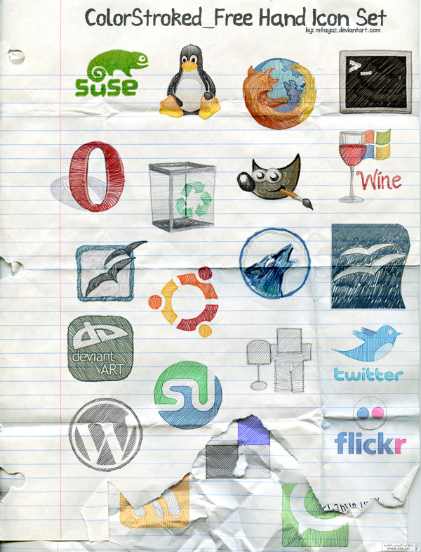
ColorStroked Freehand Icon Set

download the drawing icons

Download ( mirror ) ~ 1 Mb / / Source

ColorStroked Freehand Icon Set - contains 29 animated icons in format PNG. Resolution of 150x150 pixel icons.Social icons, so the focus is primarily on the bloggers / webmasters. Performance is very nice, something like the shaded icons.

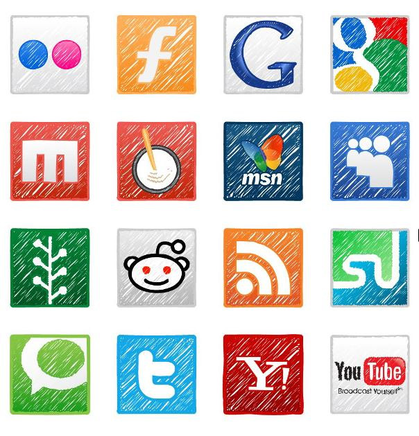
Social Icons Hand Drawn

hand-drawn icons

Download ( mirror ) ~ 900 kb / / Source

Social Icons Hand Drawn - a set that contains 18 icons, hand-drawn, for the popular social services (Twitter, Facebook, Digg, etc.), as well as the previous set, may well be suitable for your blog. In a set of typical dimensions are different from 24x24 up to 64x64 pixels.

Handy

painted icons

Download ( mirror ) = b, 4 Mb / / Source

Handy - qualities of icons in high resolution (256x256 pixels), perfectly suited for blogs because they contain mostly social icons, like Facebook, Digg and more. The kit includes a vector sources, so you may want to modify something to your liking.

I hope these sets of hand-drawn icons, you will definitely come in handy! A couple of icons can be a very fit seamlessly into their websites and blogs.

Read More →

Retro Style in Web Design

According to the American writer John Steinbeck, most people live ninety percent in the past seven in the present and the future is only three percentage points. Well, it counts Nobel laureate for literature is too difficult to verify, however, dispute the fact that the appeal of the events of the past is not necessary. If a painful sense of the value of passing time and the appeal of antiques you are familiar, perhaps, retro style in web design will be your skates.We can only think, will satisfy the concept of a retro-audience share. Who will be delighted with the content, masterly powdered antique? People who nostalgically peering into the symbolism of a bygone era, with its fashion, people, machines and other stories, covered with a dusty coating otgorevshih passions.

In clothing, automotive and interior design for a retro-style confident enough to tie the timing of the 20s to the 80s of last century. Writing a clear time characteristics of retro-style in web design is not easy, because in everyday life can be considered the last day, in a rapidly changing IT-sphere can be safely called day before yesterday afternoon. And the fact that thirty years of the artist still finds it relevant and modern, youth has long been written off for scrap. Take, for example, the results are disappointing for producers rent the movie "Alien": Bandit romantic swashbuckling 90 not stir the soul teenager, as retro - it is each his own.

But the more interesting and more difficult to challenge for a designer who decided to work out the style of the site is in a retro-style. Only the knowledge of the nature and characteristics of retro-style, coupled with a considerable sense of proportion, will not slip into a banal kitsch.

Most of the time intervals that can safely operate a designer decides to use the retro style, tied to the fashion of the 20th century.

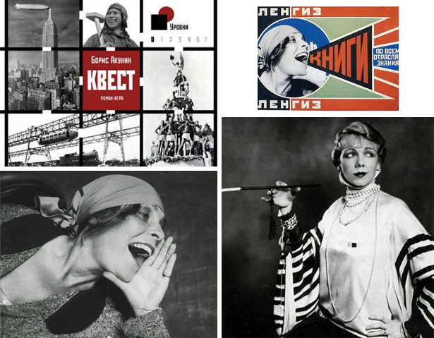
Want to recreate a visitor feel aggressive chic 20-30s - help him remember the muse of Vladimir Mayakovsky Lilya Brik, good will and Ellochka-cannibal from "The Twelve Chairs." These were troubled years of sudden and massive women's emancipation: women wearing pantsuits, shortened skirts and smoked long cigarettes. All of these mesh stockings, knit hats and bowler hats a la Charlie Chaplin, bare arms and shoulders in a fur boa during the NEP, notably stirred the blood of man in the street. Take the olive, black and purple color as a base, add the drive of jazz improvisation, story and cinematography airplanes - and you can easily catch the essence of retro-20's and 30's!

Retro 20s

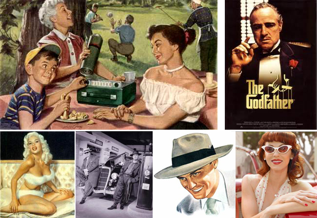
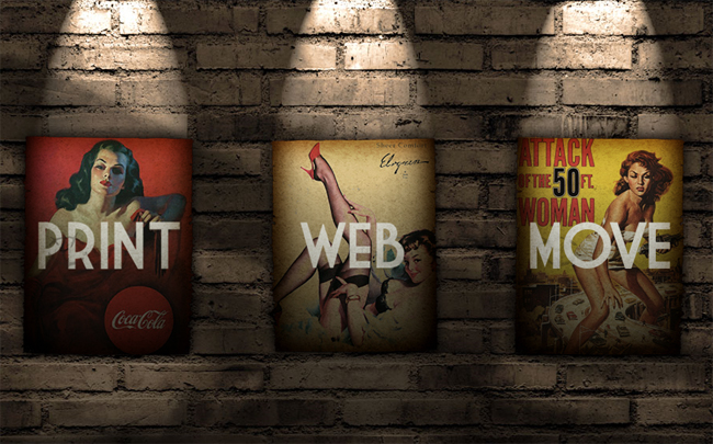
If you no longer taste restraint and modest elegance L - look back in the postwar 40s - 50s . In place of ostentatious vulgarity and pretentiousness new look came a style invented by Christian Dior. Style sensual, decadent, recklessly romantic, stylized "krinolinovy» XIX century. It airs raised chins of women in dresses of silk, satin, crepe de chine. This is a thin waist, neckline exciting and gloves to the elbow, wide-brimmed hats and patent leather straps that boost to the limits of femininity polupristoynogo pin-up. Review "The Notebook" Nick Cassavetes and "The Godfather" by Francis F. Coppola, include Glenn Miller Orchestra recording and quickly grasp the tablet. Have you caught the mood.

Retro 50s

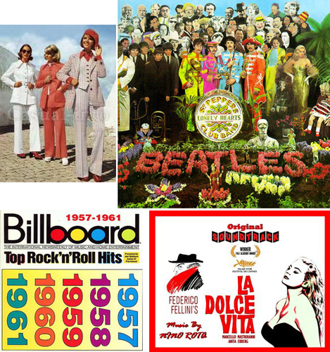
Would you like to bet sexuality and sensuality - Browse through magazines 60s and 70s . While the tone was set seductive film star Brigitte Bardot, Marilyn Monroe, Sophia Loren. The color palette matches the mood - it is the dominant red, pink, blue in the range of flowers, polka dots, the cell. Car rides chic "Bentley" on a dizzying seditious motives of Elvis. The Beatles "they" VIA "Gem" - the "us." Denim 70's, platform shoes, disco dancing to the music and the sea of synthetics in clothing: nylon, nylon, krimplen wild colors. ease, brightness, ease - that's how it will be possible to describe the site in a retro-style 60 - 70 years.

Retro 70's

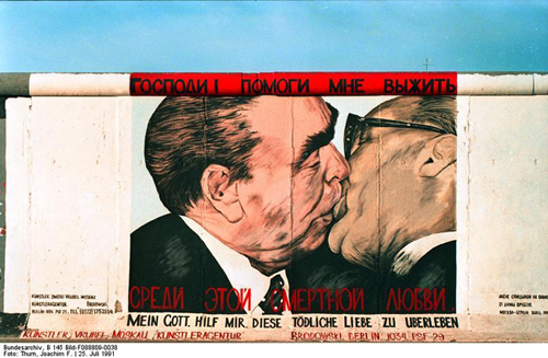
It may be an unusual experience in the style of Soviet culture of the 80s of XX century - a time when the ideology of the ruling party kultprosvetovskaya staggered under the chaotic but powerful blows protest basement subculture. Emerged from the underground Soviet Russian rock and punk rock mixed with dance tunes broken disco 80's became the leitmotif of Surgery. This period is not so deeply redesigned web designers, so the decision to use the style of the '80s can bring great success.

Retro 80's restructuring

retro pattern

To sum up. Retro-style actually quite stable and marketable trend in web design, with its charm and unique color palette. What would you choose: tragic nepmanskie 20th, 50th caramel, floral 60's, disco 70's, or nomenclatural retro 80's, building on the past, adding to their feelings and are actively using rich graphic editors, you able to create a small masterpiece.

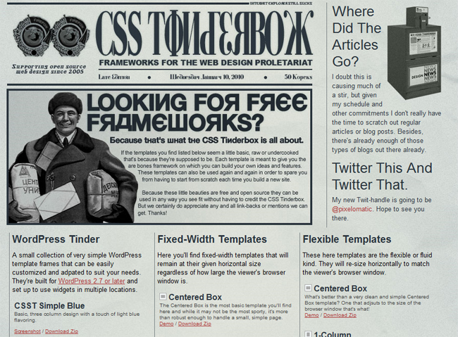
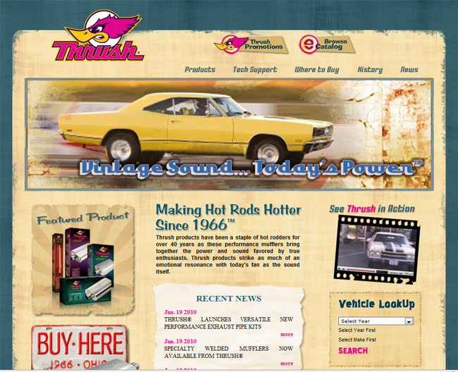
In addition, color palettes can be retro-inspired style in a small collection of retro designs (for a particularly interesting instance you can go through a reference on the original sites and see how everything is done).

Retro Site Design

retro design of the Internet

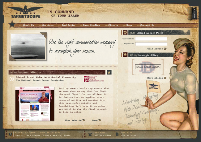
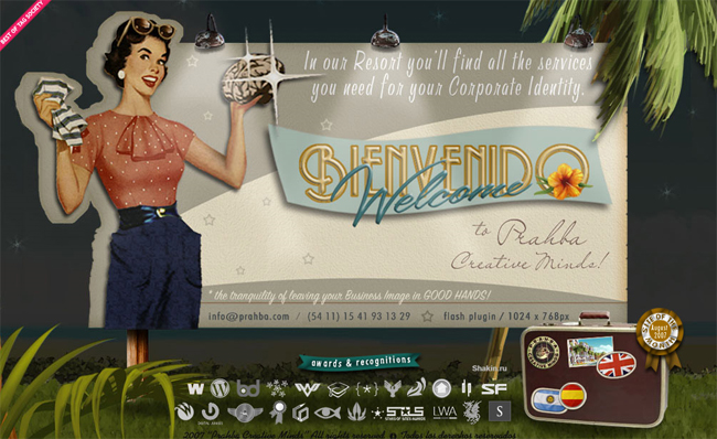
Dallas Advertising Agency - a very original navigation, music in the background and a military general, a retro style.

design of retro

Retro Style

Retro style

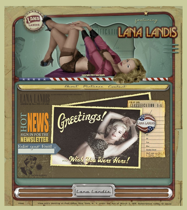
Lana Landis - on the implementation of flash, always check out the photos :) beautiful vintage photos + wonderful music

Retro Design

retro-style in design

retro flash site

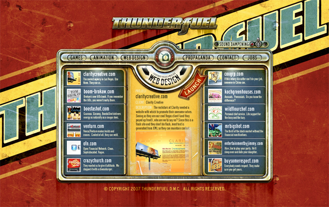
ThunderFuel - as far as I understood the company is engaged in everything from design, to animation and games.After reviewing their site in flash retro style, I'd have ordered something cool idea and implementation.

Retro Style Web Design

vintage poster

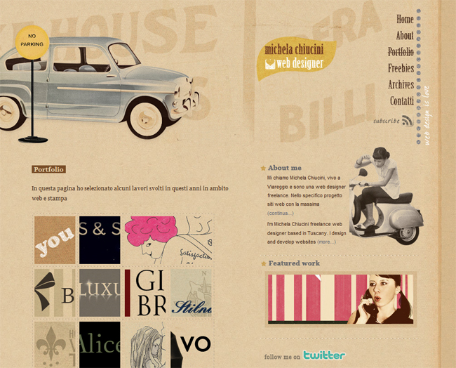
Site-portfolio Michela Chiucini web designer - by the way, it is her past work, we see that it is clearly not indifferent to the retro style

web design, retro style

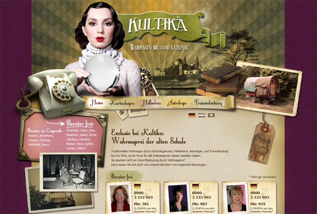
Kultika - I do not understand the purpose and subject matter of this site, but the implementation just beyond all praises!

Retro Design

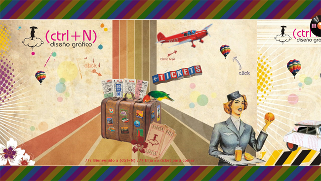
Diseño Grafico - cool retro-style poster for the Web developer studio or freelancer, he seems to be stretched in a line and when you click the picture moves to the right.

design of retro style

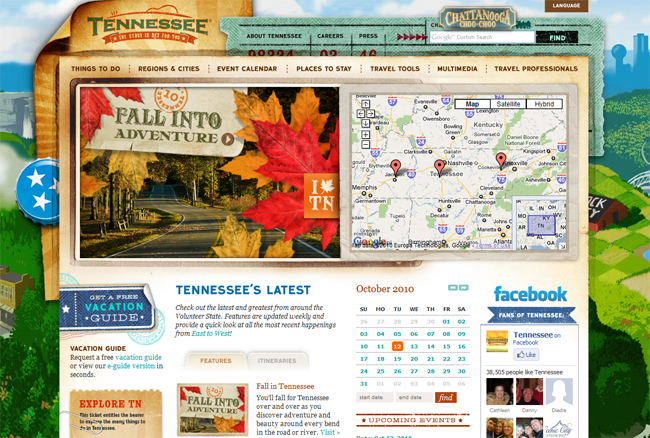
Tennessee Vacation - for all lovers of the State of Tennessee, and leave in those parts, very cool implementation of a retro-style, where attention is given to almost every detail, one of the best sites in a similar style that I've seen

Here's a collection of web design in a retro style has turned out. In my opinion, very good work here presented, although, of course, retro sites exist on the order of magnitude. And that means that I need to Find and publish as early as next time.

Read More →

How to make a website easy. Usability by Steve Krug

Looking the other night in my mail and found it an interesting letter from the publishing house "Peter." If someone had told me something similar institute in distant years, when does the reading of some books on computer topics, would never have believed it. Now, given my profession blogging and authorship of the project design Mania, they offered me a little bit, and collaborate together to tell blog readers about an interesting book. The practice, in principle, quite typical in the blogosphere, so of course I gladly accepted. For the theme of the project is best suited Steve Krug book " How to make a website easy. Usability by Steve Krug on a method . " And if the web design for me is more a hobby than work, the creation of the site and the question of its effectiveness - the theme is much more intimate.

Steve KrugTo begin with a few words about the author. Steve Krug (Steve Krug) - usability specialist, bestselling author in the same yuzabilti "Do not make me think." He works in his own consulting company, has a great many years of experience in the design of interfaces and overgrown with usability testing.Boasts some of the most renowned for its customers such as Apple, AOL, the IMF, Bloomber.com, etc. Most of the time Steve Krug is engaged in conducting seminars, well, just consulting.

Honestly, before the book came in the mail "by the method of Usability by Steve Krug" only known to me was the usability experts , Jakob Nielsen .Now, we can say, I expanded my (and yours, I hope) because the horizons of what Steve has to tell the public. After the first book, "Do not Make Me Think" Krug has become a very popular specialist, began to actively organize seminars, advise, and then at one point, he says, in a weak moment signed a new contract with a publisher.

For example, the question of whether this world need another book on usability testing? You can read the following.

I did not invent the wheel. Usability testing has come into our world long ago, and many famous people, the most influential of them - Jakob Nielsen, more than twenty years of preaching the idea of ​​"affordable usability testing."

There are several wonderful books, which explains in detail how to test usability. I strongly recommend that you read at least one of them, when you happen to do testing. His favorite book on this theme, I have listed in Chapter 15.

However, this book differs from existing in at least two aspects.

It is not comprehensive. I guess you did not become usability and will not be a matter of life and that this word is not even in your job description. If so, you will not necessarily know all the nuances and spend a lot of time on their comprehension. This book, like the previous ("Do not Make Me Think"), I tried to make a sufficiently thin (200 pages), so that it can be read, for example, in the plane.

This book is written not to make you an expert on severe or usability testing. It is necessary for you to know which end to approach the testing itself. Some of you, of course, this theme will entice enough to need to know about it as much as possible. For these and I wrote a chapter 15. But in general, to be tested and get this huge impact, not to know anything more written on these pages.

This book is not only about how to find usability problems . Unlike many other publications, this also explains how to fix identified problems.

I can confirm all these words are 100%, though I am very involved (or rather did not do) usability, but from the first page was simply a human interest. And given how quickly read the book to find out all the details of this process somewhere along the road to transport or a rainy autumn evening - simple. In addition, such a reading also draws from the other side, that all this is really an invaluable experience, "knowledgeable" person.

And it is interesting that the question, " And your tips are only suitable for web-sites "you can find the answer.

In writing this book, I focused on testing sites, because these days most need this, and because it is possible to make the book a thin and simple. But exactly the same methods and principles can and should be used in testing and improving the whole, than are men. Network and local applications - is the most obvious sites for testing, but no one bothers with the same methods to estimate the ballots, cell phones, presentation, laid out in PowerPoint, Digital fotikom instructions and forms that you fill out when it comes to the doctor. I would suggest to you, wherever I have written "your website" to believe that it says "your product".

Actually it would be logical to continue to publish the contents of the book "Usability of the method by Steve Krug."

The discovery of usability problems

  • Chapter 1. Elephants, it can not see 20. What is an independent usability testing, why it always works and why it is so rarely performed.
  • Chapter 2. And now I saw cut my [excellent] assistant in half. In what looks like an independent testing
  • Chapter 3. One morning in the month - we do not ask for more. The plan, which you can easily follow the
  • Chapter 4. When and what to test. Why are the most difficult has to do first
  • Chapter 5. Do not hammer nails with a microscope. Who to test and how to find these people
  • Chapter 6. Take them to task. The choice of targets for testing and scripting
  • Chapter 7. A few boring checklists. Why they should be used, even if you (like me) hate them
  • Chapter 8. Telepathy without tension. Testing
  • Chapter 9. This is somewhat similar to the sport. How to captivate all the match and what to bring to their attention

Resolving problems with usability

  • Chapter 10. "Debriefing". Compare experience and decide what to eliminate the shortcomings
  • Chapter 11. Less is better. Why fix problems should carry as little as possible actions
  • Chapter 12. The Usual Suspects. Some of the problems that you will surely find, and thinking about their elimination
  • Chapter 13. Life has become better, life has become happier? The Art of pleasant manners

Just go!

  • Chapter 14. Teleportation without tension. Remote testing: fast, cheap and slightly uncontrolled
  • Chapter 15. Only for advanced users. A list of recommended literature
  • Chapter 16. Good luck, friends. A few parting words. An example of the script and the agreement on record

In general, usability testing can be very simple and informal employment. You just need to find time for it and read the book :) Steve Krug said as he held seminars that they say, first of all the assorted audience of a site for an example, and then decided to introduce an original method. He allowed himself participants usability testing - how it was raboaet :) That is the site is taken as an example and volunteer to perform some common tasks for which this is the site and set up.

Test results are almost always the same:

Talk a good time testing and eventually breaks a storm of applause for his bravery.

"Owners" of the site, all 15 minutes furiously writes, what problems must be solved, and asks whether it is possible to obtain a record of what was happening to show your team and your boss.

Others come to mind, "Heh-heh. Is that all? So I could. "

Upon completion of testing, I ask: "How do you think is worthwhile way to spend 15 minutes? - And all under the nod.

So if you somehow are building high-quality and user-friendly site, you can safely buy and read the book " How to make a website easy. Usability by Steve Krug by the method of "online publisher Peter. In the same way, find a small piece, but rather one chapter from the book.

Read More →

May 31, 2012

illustrations in Web Design

If you carefully examine any collection of modern samples of web design, you will be a clear trend - an illustration of fashion. They were so widespread that we just have to talk about this phenomenon in detail! For writing to be the inspiration gathered from notes The use of illustration in web design I hope you will be interested in reading.

The interface should not be a useless and meaningless items. Even the decorative element, if it is in place, should perform a specific function. Speaking in general terms, an illustration may play a role as a decorative element (a task which beautify and diversify the design) and informative (provides some information in a convenient and easy to read format). Ideally, the illustration serves two functions at once. Let's look at how to use illustration in web design.

Case illustration

Case illustrations create or reinforce a certain atmosphere. The plot of this illustration is usually closely related to the subject site. Consider some examples:

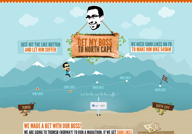
Get My Boss to North Cape (http://www.bikingboss.com/)
Illustrations in Web Design

Illustration develops the basic idea of ​​iGet my boss to North Cape. It not only beautifies, but also has functional meaning, emphasizing what actually dedicated to this project - a bet with the boss subordinate to the fact that if they gain 5000 Laika, he will have to go the long way to go.

Launch Kit (http://getlaunchkit.com/)

Illustrations in Web Design

In the case of site Launch Kit performs background illustration of just decoration, but decoration relevant and seamlessly fit into the overall concept of the site. It is not necessary to draw a large, specific image that fully reflects the concept of the site, you can only slightly increase its general message as done here.

Atelier Design Anonyme (http://www.anonyme.in/)

Illustrations in Web Design

Site designers Atelier Anonyme Design in the development of the home page is fully decided to bet on the image, which actually is bekgraundom both strong means of expression. This site was created to webstudio, so we can say that the illustration serves not only as decoration but also in some sense reflects the mood, the spirit of this agency, filtering out "inappropriate" customers.

Illustration of the character

Another received a widespread phenomenon today - this is an illustration of the character. To implement the ideas that the designer needs to come up with a special pictorial character (or characters). Often this is a fictional character with whom the visitor subsequently to associate the site. Consider some examples.

inkFinder (http://inkfinder.com/en/)

Illustrations in Web Design

It is obvious that the character is used inkFinder "octopus" plays an important role, so that the site design is better remembered, and even more recognizable. The beauty of the approach to the character that you can come up with anyone and to implement one and the same image in its, making it unique.

The evnt (http://2011.theevnt.com/)

Illustrations in Web Design

The Evnt meets us another "osminogopodobnym character." In this case, its implementation is far from reality - the brain is enclosed in a "suit" on three legs. No doubt it is also a memorable element of the project, which creates a wonderful association with a specific event, the subject of a web page. Look, for this example is generally quite good design for the site, but just how much he has changed, if you remove the character!

Big Eye Creative (http://www.bigeyecreative.com/)

Illustrations in Web Design

In this case the character is not as aggressive as in the previous design. His role is minor, one-eyed creature in essence - part of the logo, however, the mood it creates, and allows you to visually review the project memorable.

Illustrated Jewelry

This type of illustration in web design is decorative. It's just a decoration, decoration, nothing more. In principle.and this option has the right to existence - the beautiful sites are also stored as projects with the "ideological" illustrations. A few examples:

1000 WP Themes (http://wp1000.envato.com/)

Illustrations in Web Design

Illustrated elements of the interface 1000 WP Themes (in the header and navigation) does not have a semantic or functional load, but help create a stylish design. Part of the beauty and stylish design gives some idea of the capabilities and features of wordpress templates and designs developed by this company.

Coca-Cola History (http://www.cocacola.pt/historiasfelizesparacomer/)

web design illustration

The illustrations on one of the projects, Coca-Cola created solely to decorate, to diversify and make the design more modern and fashionable. The picture shows the real thing, but played with in such a way so as to fit into the overall look of the site.

Metaphiziks (http://www.metaphiziks.com/)

web design illustration

Illustration used to create a pleasant background. The case when this technique is used correctly and wisely only - all the elements of the background to the fonts, texts, and even the icons are perfectly matched and perfectly complement each other.

Illyustrirovanyy text (font)

Font painted arms will ever compare with the "machine". Fancy phrases and sentences are always in their own unique skill and use than many modern designers. The solution in many cases quite advantageous and beneficial to the overall impression of the design of the site, in addition is the ability to create unique (original) elements. (On this occasion I want to note that in the design of Mania is a separate section of the fonts - there you will find a couple of interesting options)

Rangus (http://www.rangus.co.uk/)

web design illustration

In my opinion a very bright and successful example of an illustrated text. Note also the interesting animation (could move the mouse pointer on different ELLEMENT). By the way, Rangus can also cite as an example of how design containing graphic-character.

Joey Lomanto (http://blog.joeylomanto.com/imitation-in-web-design)

web design illustration

First impression - an illustrated label in the header is in perfect harmony with the other design elements. Perhaps, once you do not even pay attention to the fact that the text is made in the style of handwriting, or here, for example, has been used for a standard font - however, it all goes well with the overall design of the site.

Informative illustrations

This kind of puts the main purpose of illustration and explanation of the definition. This is, in principle, and is the essence of the approach is nothing special to add, so just move on to some examples:

Bookish (https://booki.sh/)

web design illustration

On the home page of this site illustration defines the essence of each of the elements of design. The individual "blocks" are supplemented by an illustration, not just for beauty, and the image (more importantly) explains the purpose of the item. With this approach, you can not even grasp the meaning of particular description in order to understand where everything is - the picture in the lower left corner, where the mobile phones and tablets, the most striking evidence of this.

Vitality City (https://www.vitalitycity.com/)

web design illustration

Turn the "Globe" in the Vitality City and you will see that this is not a fashion illustration of "accessory" and the element of the semantic load - get the original illustrations navigation.

Uklizenodoma (http://uklizenodoma.cz/)

web design illustration

A very striking example of where design is taken as a basis for illustration of the information - this or that element of the design space (in this case) has his signature and a link to a detailed explanation.

Illustration-antidote (antidote)

This is the last, but very interesting kind of illustrations that I want to tell you today. Let me explain what these things mean a strange name. Sometimes you need to distraction illustration, primarily on the effect of technological interface and allowed to think more intuitively. The task of "illustration-antidote" in this.

Shipment App (http://shipmentapp.com/)

web design illustration

Illustration in this case is akin to a work of art - creates an unforgettable image that definitely makes you forget that you even visited the web page.

Egopop (http://www.egopop.net/)

web design illustration

Not such a bright example, as the previous one, but in my opinion, too, illustrates the approach is not bad.Looking for a Home Egopop forget that you're dealing with a website - it is rather small interactive work of art, which, however, gives some understanding of what it was dedicated to this site (which is also important).

That is, in principle, and all for today. As a conclusion we can safely say that illustration in web design - one of the most exciting and essential techniques. It has enormous potential, which can be implemented in hundreds of different cases and variations, creating the designs are not similar to each other. In a sense, this is the most creative and artistic approach while, in fact, fantasy and design features at the same time in no way limited.Successful you are in the pictures!

PS Cognitive site for smart women will tell what fashion designers can they please and surprise - clothing fashion trends, unique jewelry, etc. 

Choose the name of an unborn child? - The process is not easy, of course, I think the value of the name and description of the different names have a little help with the decision. 

Buy a book on the Internet - there is nothing easier, go to book online store , choose a product, make out an order, pay for and expect a courier delivery.


Read More →

May 23, 2012

Free Premium HTML Email Newsletter Template

In this article i will provide you best Free Email Newsletter Template. Email newsletter is a source to marketing your product and grow more sales.

If you want more sales then you must have a great amount of knowledge about marketing tips & what type of source, commonly html Email newsletter is used by other brand companies. Here are some of the html newsletter Template so you can download it & used for marketing of your product. All the best.


Dressmade E-mail Template

Dressmade E-mail Template - ThemeForest Item for Sale

Dressmade E-mail Template consists of 8 different layouts in 10different colors and customizable HTML theme for your Business.

Features:

  • 80 Valid E-mail Templates
  • 8 Themes
  • 10 colors variations
  • Modern and Clean Design
  • Valid HTML Code
  • All PSD Files included
  • Well Documented

Bussiness Templates

Bussiness Templates - ThemeForest Item for Sale

Business Templates is a Modern and Clean Design email template.4 color variations and 16 different layout. It is easy editing of content and layout.

Features:

  • Modern and Clean Design
  • 16 Valid E-mail Templates, 4 Themes
  • Well commented valid HTML
  • All PSD Files included
  • Major E-Mail Client Support

Leaflet Corporate Newsletter

Leaflet Corporate Newsletter - ThemeForest Item for Sale

Leaflet is a corporate, business newsletter template containing 3 background shades, 3 color variations and 4 different layout. It is easy to customize by simply copying and pasting code.

SmoothHost E-mail Template

SmoothHost E-mail Template - ThemeForest Item for Sale

SmoothHost is an e-mail template which is perfect for your hosting or services business. The pricing tables have a ‘best deal’ look which you can use for your deals or discounts. The template consists of 1 design in 2 color schemes.

Please note that basic knowledge of XHTML and CSS is required to customize these templates.

Portfolio Email Template

Portfolio Email Template - ThemeForest Item for Sale

Modern and clean HTML Email. Minutely designed to become compatible with many mail readers. Ideal for use in design agencies, personal portfolio, presentation of work, disclosure project, among others. And can also be adapted to your work.

Features

  • 674 Pixels width;
  • 04 Layouts + 1 Extra Variation;
  • 2 Versions: Dark and Ligh;
  • 13 Colors variations;
  • 117 HTML Files fully customizable and ready for use (simply just change text and images);
  • Can be used with background;
  • The MAIN .ZIP file contains 10 backgrounds included for customization of the templates (5 options for ‘Dark’ version + 5 options for ‘Light’ version). Total of 585 possible combinations of design;
  • Valid Code;
  • Inline CSS ;
  • Full layouts (layered PSD and layered PNG included);
  • Code commented for easy customization files;
  • Easy duplication or deletion of areas in the project;
  • Send easily with MailChimp (tutorial included);
  • Compatible with major readers of the email;
  • Help_Documentation.pdf included in main.zip file. Contains tutorial with screenshots and how to manipulate the files and send email with MailChimp;

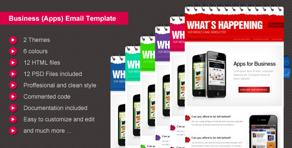
Business E-mail Theme

Business E-mail Theme  - ThemeForest Item for Sale

This product is the HTML version (with all PSD layouts) of my item on GR:

Professional and customizable HTML theme for your Business.

Use it in your email campaigns.


Features:

  • 12 Valid E-mail Templates
  • 2 Themes
  • 6 colors variations
  • 6 PSD Files included – all templates (2 versions in 1 file)
  • Fully layered .psd files
  • PSD files for customization and replace of the images (logo, featured image, buttons, etc)
  • Documentation
  • Modern and Clean Design
  • 650 Pixels width
  • Valid Code
  • inline CSS
  • Commented Code
  • Flexible Layout: Easy to Customize :colors, sets of news
  • Proffesional and clean style
  • Perfect for business use like mobile apps but not only

E-Business HTML Email Template

E-Business HTML Email Template - ThemeForest Item for Sale

E-Business email template(s) comes with bulletproof valid HTML code.
Renders perfectly across all browsers, desktop & email clients.

It easily fits your purpose…: Business, Portfolio, Gallery options, Internet Marketing, Promoting, Automotive, Computer Hardware & Software, Hosting Companies, Communications, Financial Services, Technology & Hi-Tech, etc.. Possibilities are only up to you.

Philadelphia - Minimalistic E-mail Template

Philadelphia - Minimalistic E-mail Template  - ThemeForest Item for Sale

This design is perfect when you’re looking for a clean and minimalistic newsletter to keep your visitors up to date. It comes packed with several structures and colors.

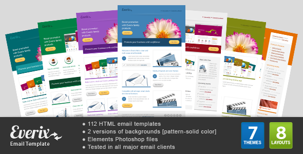
Everix Mail

Everix Mail - ThemeForest Item for Sale

Welcome to Everix Mail a premium and unique email template, comes in 7 color themes, 8 layouts each, every one of them has 2 backgrounds (pattern background and solid color background).

Features & Content

  • 112 HTML email templates (7 color themes, 2 background versions of each color, each version contains 8 layouts).
  • Layered elements PSD files.
  • Well commented valid HTML .
  • User friendly documentation covers PSD & HTML editing, sending email template, using it in Mailchimp, and useful tips.
  • You can copy/paste content blocks (tables) from layout to another.
  • You can delete/duplicate any content block (table).
Read More →