Sooner or later even the most successful design to date. Sometimes you can get a slight redesign, and sometimes require radical renewal, referred to as rebranding. Very often these processes began to appear with the acquisition of the popularity of so-called design style Web 2.0 , which simply did provoke a serious company for updates and follow current trends.
From the standpoint of the integrity of the brand's radically new design is not always acceptable, in at least a step risky, because that way you can lose face. But even those who are at risk was up to "moderate" is not a revolutionary redesign. Let's look at examples of how to solve this problem (and solved) the designers of famous sites. As inspiration, has been used , this English-language paper , reflections are copyrighted. First published on the old design, then a new one.
31Three
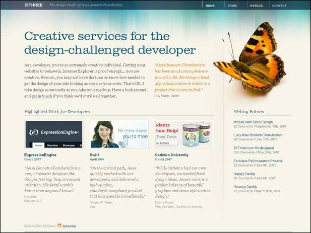
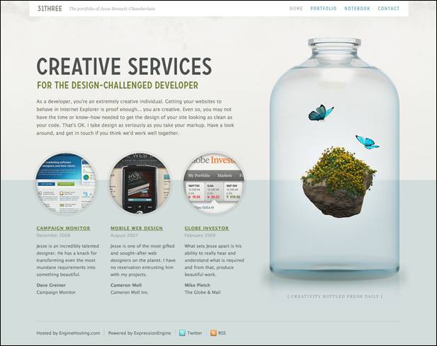
During the redesign was otherwise decided 31Three space (it was more) and changed a few colors, why design has become more "pure" and "air." Perceive the information has become much easier once it is clear that the page has the greatest value. Definitely a successful redesign, or should I say effective - catches.
Brightkite
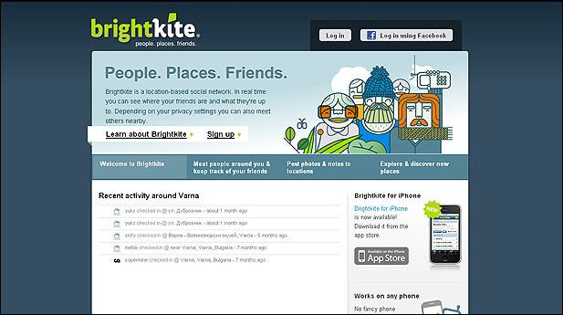
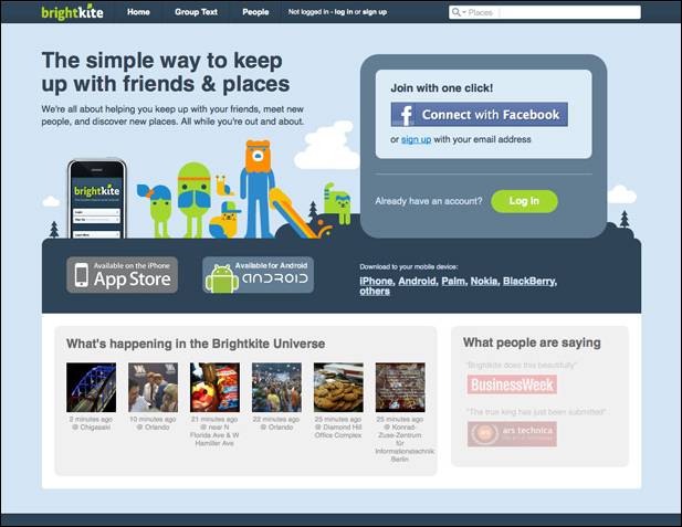
Brightkite has undergone major changes. The new design got rid of the heavy dark-blue substrate to replace the cap had come a lightweight upper panel. Visually zaokruglennye angles acute and successfully replaced by "splitting" last version, the big headlines emphasize the key parts of the project. In general, the new design creates the impression of a comfortable and well made. The previous version looked less than professional and integrity. The redesign was a success.
Ollie
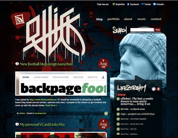
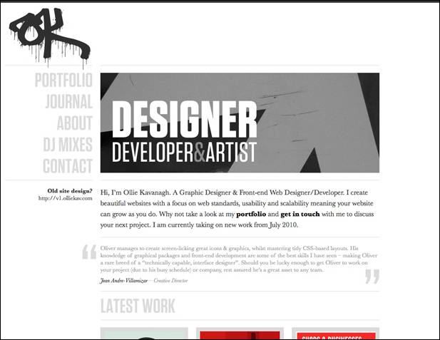
In my opinion, the site is only won by Ollie redesign. The old one was too dark, dirty and a bit chaotic (this applies to both elements, as well as flowers and other things). The new design is in sharp contrast to the fact that it was, it is close to minimalistchnomu - a little strict, but neat. The only "a quote from the past" - a logo, which, however, fit quite harmoniously. Although my impression of a matter of taste, some people may notice that the old design could be more creative and stylish - it is quite possible, and sometimes because of the redesign is the author's desire to change something, sometimes dramatically. I think this is the case.
N.Design Studio
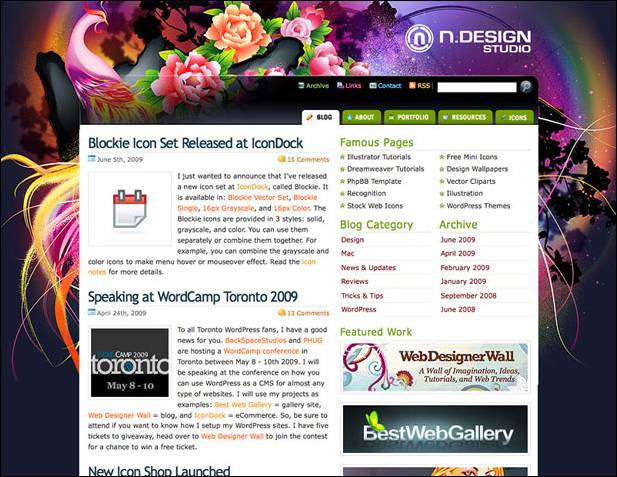
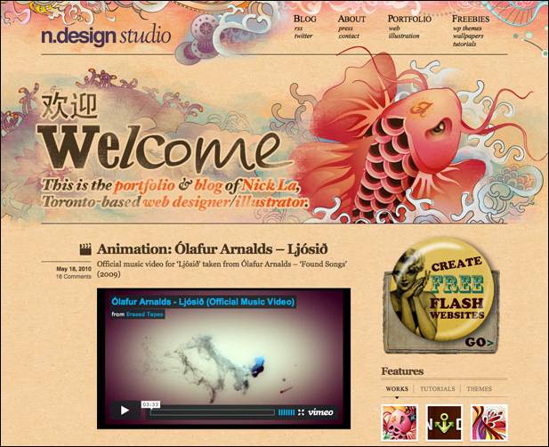
The project site N.Design Studio was always very bright, expressive and powerful in terms of design (which they say "showmanship"). Despite all the advantages of the old design become boring.
The new version of the design is small enough in common with the previous one. However, done very cleverly, keeping the continuity of the least of it. The new design may be surprised (those who are accustomed to the old), but leaves the impression of an extremely favorable.
DelCastillo
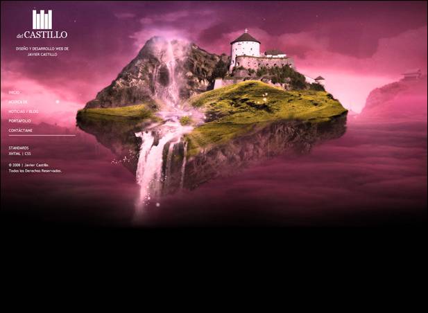
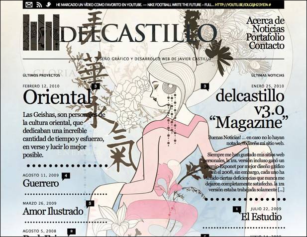
Designers working on DelCastillo decided on a bold step. The original version of the site showed a quiet traditional design and layout, the new version - a bold, "the log" layout, typography and vivid emotion. Such a redesign may be called for something extreme, but nevertheless, most successful rather than vice versa. In recent typography in web design is more and more weight, probably, the authors decided to comply with the new fashion trends.
Design Cubicle
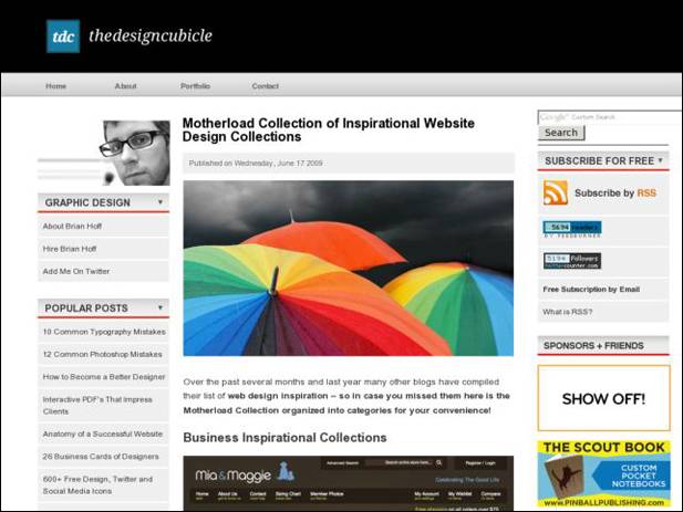
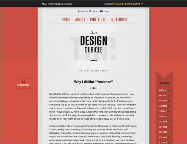
The first thing that catches your eye in the new design Design Cubicle - considerably fewer elements. The second - the design is almost centered. The new design "easier", more convenient, while brighter (even if you do not confuse the bright umbrellas in the screenshot with the old design - it is an illustration of the post, not a design element). The desire for minimalism and concentrating attention solely on the contents - is also very popular for modern web design.
Carbonmade
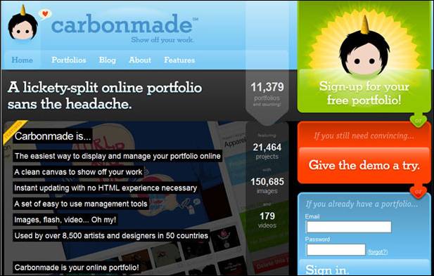
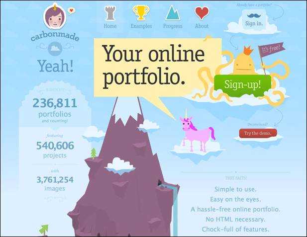
The new version of the design Carbonmade also very different from the previous one. The old version was obviously too heavy (which was the fault of mourning, a vast gray area under the cap). The new design is based on the idea of graphic (in the center of the mountain, rich in illustration), it is more clear, positive and creative. Visually looking at the page of the site, personally I remember such a thing as infographics , which is often used in the design for the presentation of information.
I often want to do for his redesign of the blog, sometimes almost dramatically change everything. Unfortunately, this is not a quick and easy process, so until that time is not enough, perhaps in the future, I still come to that.


0 comments:
Post a Comment