Showing posts with label site development. Show all posts

May 31, 2012

Ways to Navigate Users to the Site

Imagine that you are traveling by car, but because of traffic jams all the main roads are blocked and you need to turn in an unfamiliar part of town. For a while, moving in the right direction will help you to road signs, but suddenly they disappear. It seems to get lost in an unfamiliar place pushover.

Any site, regardless of its ultimate goal should be to perform the main task - to specify the path to the user information of interest to him. However, perhaps the fault of their own, and perhaps the fault of the designer, the user is lost and does not know where to go. How do you help your visitors navigate the site. There are several effective ways.

Page Titles

Each page of the site needs to be unique, rather short, but no less meaningful title. The title tells users that it can be found on a given page. Page titles performs its function is much more effective if:

  • more basic font header text at least a couple of pixels;
  • used a different font color, font or background;
  • there is a noticeable space above and below the title.

Bread crumbs

"Bread crumbs" is called a chain of links that are intended to show how the current page belongs to the principal.Often they are located directly above the page title. For example: Home> Forums> Jobs> Jobs.

Advantages of "bread crumbs" in their ability to instantly point to the location of the user, and to help the latter understand the structure and hierarchy of the site. The user sees, how he got to the current page, and how he go back a few steps back.

In this case, "breadcrumbs" show the real structure of the site, rather than the way in which the user came from.By the way, if you have a blog on wordpress, I advise you to read the article about how to make bread crumbs in WordPress using plug Breadcrumb NavXT.

Primary and secondary navigation

Although it is obvious, but not out of place to recall that it was proper to use the primary navigation is the most powerful tool to guide users. It is desirable to make the navigation controls other than the color and the background, the names of navigational elements should closely match the page title. In contrast to primary navigation, which determines the sections of the site, the secondary takes the user to specific pages. You can use the PSD files beautiful menu for the site , which were published in the last article.

References

Links must clearly communicate, where they lead. Users are more likely to pass by reference, if there is to know where it leads. Do not load the page meaningless slogans like "Click Here". As the names of other elements of navigation, the names of references should correspond to the target page title. Some tips on design options , you can also find in this blog.

The structure of the page

An important role in the site navigation and structure of the plays of its pages. When designing pages, remember that:

  • Many users are familiar with the standard structures of sites, so the location of the navigation controls in the places where they expect to see, makes it easier to navigate. Try to avoid too "clever" designs.
  • easier for the user to decide where to go, if the key elements (links) are close by. Try to group the key elements.

Progress

It is desirable to show the user steps in the procedure that he performs on the site (we are talking about procedures that require sequential visits to several pages, for example, when ordering the goods in e-commerce site or downloading files.) Make progress is easily visible to the user saw his current position, passed, and the next steps.

Site Map

Availability of maps is important for sites with many pages. That's really where it's easy to get lost! Go to the map can be accessed when the information can not be found by searching the site, so the site map should fully reflect the structure of the latter, to be clear and understandable. To create a wordpress site map for your blog , you can use plug-dagon design sitemap generator.

Title page (Title)

Title page - the text, which is located in the browser's title bar. Remember, the shorter the name, the easier to understand its meaning. Important information first place, since it is often the first few words are the most important to users. The meaning of the name should remain clear, even if the page is not visible (in your history or favorites list.)

In general, all requests for user navigation will be extremely positive influence not only on the positive perception of the project from the visitors. Some of them are also useful for search engines - site map, breadcrumbs, the name of the page - all the right things. In addition, the better the usability of the project, including navigation, the better it will work and the more he will be giving.
Read More →

Redesign: A Few Indicators That His Time Has Come

Redesign. One word can make all shudder a web designer and developer. The imminent danger in the form of constant revisions and improvements of the project, as well as indispensable to their shareholders' views, "the team are immersed in the depths of despair, the site (the more, the more options for the redesign is considered).But despite these realities, it is necessary to admit that redesign is an integral part of the life cycle of any online resource. We look at a few key indicators that clearly signaled that the time has come redesign. And if it does come, how solid it should be.

Site statistics for fall

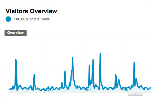
The main indicator that the site needs work, is a downward trend in the statistics of the site. Of course, this symptom may be other reasons (for example, your product does not meet the requirements of the market). But if these reasons are eliminated (or offset), the steady decline in conversions, sales, and the interactions of the total activity of users indicates that the current design outlived its usefulness. Many attribute this to the "satiety" users old design. But in reality it is an indicator that you've lost touch with their audience. If you want to redesign solved the problem, analyze the actions of visitors and see where in the workflow design flawed. And then enjoy a correcting these flaws in the first place.

redesign of the site

Metrics - the most important indicator

The extent of the changes in design may be limited to: correction of the sequence of conversion or optimization activities associated with the product. It is not necessary to completely change the image of the product, generated for an external audience. Many webmasters and emphasize the effect of changing the force redesignthat results in increased traffic the project.

Your users will say that the time has come

Indicators of site statistics - the most obvious indicator that instantly makes you realize that something is wrong.But to understand what is wrong, you have to communicate with their customers.

Poll - a good tool for such purposes, but the test for usability is much more effective. If you have a blog on wordpress, it will help with the voting plugin WP-polls . The gradual development of the dialogue in person allows you to analyze the dynamic process of interaction between the audience with the site. In a typical survey is impossible. If during the test, you will come across with some strong opinions that shed light on the reasons for the decline of metrics site (and you run into them), this means that it's time to redesign.

Tests on usability , not only reveal problems but also the dominant attitude toward your product. It can also be used as a basis for redesign. In some cases, negative attitudes toward the brand may be reason enough for a redesign. But all this you will never know if you do not communicate with their customers.

time to do a redesign

The final decision is yours

Fidbek from customers helps us understand exactly what to change in the site and to what extent. Most often, communication with buyers focusing on individual elements of the business process. And it is these elements should be addressed in the redesign. But if users fidbek was quite extensive and affects many aspects of the site, it makes sense to use this information for a more thorough redesign.

List of technical and UX-debt becomes too long

Note: Technical Debt (tech debt), and UX-duty (User Experience debt) - this is the work of the project, we decide not to do at this time because: Deadline "burning", the leadership is putting pressure, etc.

In the process of developing a product or Web site, the company begins to accumulate technical debt and UX.These debts - the work that had to be done at the initial stage of development, but either it was not time, or you had to do something easier and cheaper to run the project on time. With each successive iteration of this sheet "debt" will inevitably grow until it becomes so long that all of these defects can no longer be correct.

There are many ways to keep growing list of those debts in a relatively stable level, but at some point it reaches its limit.

If your car ever breaks down and the repair is more expensive than the cost of the car, it is easier to pass on scrap metal. Similarly, the site at some point simply to rewrite than to correct any errors. This is an excellent time to carry out redesign.

When the list of debt becomes too long, it's easy to succumb to desire to do "partial redesign", correcting some flaws. However, these actions lead to what the Americans called the «death by 1000 paper cuts». Which means: more small fixes you make, the more you have problems with other functions of the site. If in fact sheet debt reached its limit, it is necessary to think seriously about the redesign.

It just looks "old"

The appearance of the site affects how users perceive your brand and what level of confidence in him to have. Even if the design of the site has been the trend at the time of launch, but today it can no longer be the case. The design is constantly changing and evolving. The "old" design will prevent the development of the product, and it will affect the performance of site statistics - they will fall.

How do you know whether your website is obsolete? Look at your competitors. Look at the widely advertised new projects in other areas of business. Compare your design with those samples that are really well executed. This will allow you to see whether your design current trends. The complexity of this approach is that the approach to the assessment of other possible sites without bias. Seeing your site every day, constantly working with them, you may feel at some point that he is old and needs updating. Check if your objective evaluation, comparing it with what they think about this site your employees.

doing a redesign

Decide what to remove, and that add

In this case, the redesign will be superficial and will affect the update of the presentation layer of the site. With this redesign scenario of user interaction with the site or the conversion of the scheme remain the same. Although, no doubt, upgrade design will have an impact on users and on the conversion.

In conclusion,

Our list included a few simple indicators that clearly indicate that it is time to redesign. But they are certainly more. The number of indicators that appear in your situation will determine the need for redesign. While each of these indicators is itself reason enough to update the site.

Maintaining the current trend and design in an online environment brings good dividends in the form of a stream of new customers conversions and brand commitment. In addition, it has an effect on employees. Seeing a regular on the horizon, the upcoming redesign, they will try to keep abreast of technological developments and design finds.

PS Redesign beuslovno good thing, but we should not forget about the promotion and SEO optimize your site for search engines, the only way to increase its audience. 

in particular need to promote if you have a business on the Internet whether photobanks for earnings in the photoor cooperation with the various exchanges of automatic links and articles. 

Travelers to cities in Ukraine, or those who travel on business trips, apartments in Kiev on the financial possibilities largest selection of apartments and convenience please.

Read More →