Every webmaster has heard for a long time, and someone has masterfully applied in practice, new and unique features CSS3. Not so long ago we discussed some interesting text effects , this time it will be a gradient buttons that were created without the use of graphics (pictures), that is, only by means of CSS3. Sam, I found a tutorialhere , you will also offer translation.
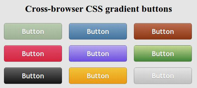
So the basic qualities of the future keys (buttons):
- Scalability (depending on the size of the font and size of the text);
- Functionality, usability (includes state of the button - normal, hover, active)
- Backward compatibility (even on old or not compatible browser buttons will look decent, though certainly not as intended. This can be verified at the end of publication);
- Flexibility (these styles can be applied to other elements, not necessarily for the buttons);
What chips will be used in the process sozdnaiya buttons? The result is achieved due to the gradients, the properties box shadow, text shadow, rounded corners, the regime RGBA.
Structure of HTML
<a href="#" class="button button-blue"> <span> Button </ span> </ A>
CSS
. Button { margin : 10px ; text-Decoration : None ; font : bold 1.5em 'Trebuchet MS' , Arial , Helvetica ; / * Change the EM value to scale the button * / display : inline- block ; text-align : center ; Color : # FFF ; border : 1px Solid # 9c9c9c ; / * Fallback style * / border : 1px Solid rgba ( 0 , 0 , 0 , 0.3 ) ; text-Shadow : 0 1px 0 rgba ( 0 , 0 , 0 , 0.4 ) ; box-shadow: 0 0 .05em rgba(0,0,0,0.4); -moz-box-shadow: 0 0 .05em rgba(0,0,0,0.4); -webkit-box-shadow: 0 0 .05em rgba(0,0,0,0.4); } . Button , . button span { -moz-border-radius : .3 EM ; border-radius : .3 EM ; } . Button span { border-top : 1px Solid # FFF ; / * Fallback style * / border-top : 1px Solid rgba ( 255 , 255 , 255 , 0.5 ) ; display : block ; padding : 0.5em 2.5em ; / * The background pattern * / background-image: -webkit-gradient(linear, 0 0, 100% 100%, color-stop(.25, rgba(0, 0, 0, 0.05)), color-stop(.25, transparent), to(transparent)), -webkit-gradient(linear, 0 100%, 100% 0, color-stop(.25, rgba(0, 0, 0, 0.05)), color-stop(.25, transparent), to(transparent)), -webkit-gradient(linear, 0 0, 100% 100%, color-stop(.75, transparent), color-stop(.75, rgba(0, 0, 0, 0.05))), -webkit-gradient(linear, 0 100%, 100% 0, color-stop(.75, transparent), color-stop(.75, rgba(0, 0, 0, 0.05))); background-image: -moz-linear-gradient(45deg, rgba(0, 0, 0, 0.05) 25%, transparent 25%, transparent), -moz-linear-gradient(-45deg, rgba(0, 0, 0, 0.05) 25%, transparent 25%, transparent), -moz-linear-gradient(45deg, transparent 75%, rgba(0, 0, 0, 0.05) 75%), -moz-linear-gradient(-45deg, transparent 75%, rgba(0, 0, 0, 0.05) 75%); / * Pattern settings * / -Moz-Background- size : 3px 3px ; -webkit-Background- size : 3px 3px ; } .button:hover { box-shadow: 0 0 .1em rgba(0,0,0,0.4); -moz-box-shadow: 0 0 .1em rgba(0,0,0,0.4); -webkit-box-shadow: 0 0 .1em rgba(0,0,0,0.4); } . Button : active { / * When pressed, Move IT down 1px * / position : relative ; top : 1px ; } Blue button
. Button-blue { background: # 4477a1; background:-webkit-gradient (linear, left top, left bottom, from (# 81a8cb), to (# 4477a1)); background:-moz-linear-gradient (-90deg, # 81a8cb, # 4477a1); filter: progid: DXImageTransform.Microsoft.gradient (GradientType = 0, startColorstr = '# 81a8cb', endColorstr = '# 4477a1'); } . Button-blue: hover { background: # 81a8cb; background:-webkit-gradient (linear, left top, left bottom, from (# 4477a1), to (# 81a8cb)); background:-moz-linear-gradient (-90deg, # 4477a1, # 81a8cb); filter: progid: DXImageTransform.Microsoft.gradient (GradientType = 0, startColorstr = '# 4477a1', endColorstr = '# 81a8cb'); } . Button-blue: active { background: # 4477a1; } Compatibility with different browsers
- Mozilla 3.6 and above - full compatibility, the buttons are displayed exactly as they are designed with all the details.
- Google Chrome, Safari (Webkit) - no problems found, the overall result is not worse than Mozilla.
- Opera 11 - unfortunately, the gradient does not appear at all, well at least that the rounded corners are interpreted as necessary.
- Internet Explorer 08/06 - in this case the problem is, on the contrary, with rounded corners. The gradient is present.
- Internet Explorer 9 - the situation is somewhat better than the browsers from Microsoft and past generations, but still the result is not as good as in Mozilla or Chrome.
Well, I have that's all. Now you can choose to use gradients for Photoshop , or do only with CSS. Study the possibility of CSS3, it's worth it! With HTML5 so all you can do wonders, has recently found a collection of different techniques and was very pleasantly shocked case examples.


