Showing posts with label jQuery. Show all posts

February 28, 2015

Amazing games that are only Created with web Technologies

JavaScript and HTML5 are quite powerful these days. Increasingly more games are built exclusively with these web technologies, and believe it or not, they’re quite entertaining. A couple of years back, developers were compelled to use Flash to create a game. Right now, Flash has nearly disappeared; WebGL has taken the lead. Here are a few amazing games that were crafted with web technologies.

Sinuous

One of the coolest games built with web technology; Sinuous packs sleek graphics, fluid frame rates, and an engaging gameplay. All you have to do is avoid collision with the red dots that are present in the game. Some dots however, give you power-ups, so make sure to grab those. For some additional points, move around as much as possible and steer clear of as many red dots as possible.

HexGL

HexGL is an incredibly futuristic racing game that was built by Thibaut Despoulain. It is fast-paced, fun, and interactive. Created with WebGL, JavaScript and HTML5, HexGL brings homage to F-Zero and Wipeout. The maker of this racing game – a computer science student - made it with a lot of enthusiasm and devotion, and believe it or not, it’s not the easiest racer you ever played. Do you have what it takes to make it to the finish line?

Entanglement

Who doesn’t love a well-crafted puzzle game? Entanglement was crafted with HTML5 and it has players create lengthy paths through the insertion of all kinds of segments on specific grids. With plenty of levels at your disposal, this web tech game features lots of tricky levels you’ll surely appreciate. Compete with friends and fight for the highest score. Last but not least, relish the background music sounds as they’re quite enthralling.

Cube Slam

Superbly colored and beautifully crafted, Cube Slam is a 3D arcade classic. Built in HTML5, players must defeat Bob, and they have 3 lives to do it. First few levels are easy, but as you advance you’ll see how Cube Slam becomes increasingly more challenging. The web tech game has a multiplayer mode too; this allows players to ask friends to join in.

Elevator Saga

If you’re an avid programmer, then you’ll grow very fond of this coding game. In Elevator Saga players must transport people in the most efficient way using encoding elevator moves. JavaScript is being used for every move, so programmers should prepare themselves for the ultimate challenge.

Olympia Rising

Fight with all your powers and make your way through the infinite pits of the Underworld. In this 2D action-adventure platformer, you play Iola who navigates a wealth of Ancient Greek regions in the hopes of getting out of the Underworld and becoming a person with a normal life once again. Featuring the most fluid animations and lush graphics, Olympia Rising is a 16-bit styled web game where players must slash, jump, climb and blast their way to move onto the next stage.

Escape from XP

RIP to Windows XP! Whether you loved or hated XP, this action arcade game made with HTML5 will definitely draw your attention. Basically, it celebrates the death of the famous operating system, and surprisingly it’s quite engaging. Players are in charge of saving XP’s last developer, who’s somewhere trapped and can’t get out. A must-play for all XP fans!

Out of the numerous games built with JavaScript and HTML5, it’s impossible for avid gamers not to find something to exceed their expectations. The ones we mentioned above are fun, lively, entertaining, and challenging enough to keep players busy for hours in a row. Which one’s your favorite?

This is the guest post by Fredrick Cameron and Make Up Games 365!

Read More →

January 27, 2015

How jQuery Mobile and HTML 5 Can Impact Your Mobile App Development

Whether you are interested in developing a mobile website or application, implementing an appropriate framework can help you accomplish your project in a more efficient manner. There are numerous frameworks available out there that helps one improve their productivity with the resourceful features of the development tools.

The jQuery Mobile is one such mobile framework with which you can develop your simple, cross-platform web application with utmost precision and convenience. This framework is basically a HTML 5 based UI system that allows developers to beautifully integrate both JavaScript and HTML 5 for creating a flexible mobile web app that stand up to the UI expectations of numerous devices like Smartphones, tablet, iPad, desktop, etc.

The incredible community contribution has added numerous utile plugins and other useful features that makes jQuery Mobile a viable framework. However, there are certain merits and demerits of implementing this UI system for mobile web app development. Let's have a glimpse over some of them.

Valuable Merits of jQuery Mobile and HTML 5:

  • Supports Cross-Platform And Cross-Device App Development – Today, when there are truckloads of mobile devices featuring distinct shapes and sizes, and numerous mobile platforms are available out there, the task of developing an app to target a whopping number of mobile users has become a bit cumbersome. Thus, following an approach that facilitates developers to effortlessly and efficiently develop cross-device and cross-platform app not only minimizes the overall complexity but also offers a prolific solution.
  • No App Approvals are Needed Even for iOS Devices – Seeking Apple App store approval for launching an app publicly is one of the factors that makes the platform rank low under the preference chart. However, if you have developed a web app for your website using jQuery Mobile framework, you won't need to wait for approval from the app store even if your app is targeting an iOS device. This helps you save your valuable time and efforts.

    Moreover, the jQuery Mobile app users are not required to update their app manually, rather they will get an updated version, as soon as they reload your website.

  • Faster Turnaround Time – You can accomplish your application development task by implementing this framework at a faster rate as compared to that while implementing any platform natively. That is so even if you don't possess any prior knowledge about HTML 5 or jQuery Mobile, as the learning curve for this framework is comparatively low.
  • Customizable Themes – The visual appearance of your application is quite imperative as it helps attract users. With this framework, you can easily customize a desirable look and feel to your app. And, modify it as and when desired.
  • Platform-agnostic UI widgets – Since currently, the mobile market trends are greatly focusing over touchscreen devices, the touch-optimized widgets for UI elements makes the jQuery a viable choice for developers.

Demerits of jQuery Mobile and HTML 5:

  • Can't Access All Device's Features – Since, it runs JavaScript in the browser, it doesn't facilitate access to all native features of mobile devices. However, if you consider this aspect, native apps stand ahead of the jQuery Mobile web apps.
  • Not Apt For Multimedia And Gaming Apps – The framework is preferred only for simple, data entry types applications. Native app development approach is considered much better than this approach, if one is interested in creating feature-rich, complex application like Gaming or multimedia apps.
  • No MVC Architecture Support – Model View Controller (MVC) offers different views of the software. It helps separate presentation from the logic and facilitates greater efficiency. Unlike other mobile app development tools like PhoneGap, this framework doesn't support MVC architecture.

It is essential to review the benefits and drawbacks of using a framework beforehand. Because, this helps one easily streamline their choice for preferred framework. Review the aforementioned merits and demerits of the jQuery Mobile web app framework before beginning app development. If your need a simple and efficient application for performing task like data entry, you must deploy this tools and integrate HTML 5 and JavaScript is an absolute manner. Your app will surely deliver remarkable performance.

About the author: Addison Cohen is an application developer for Appsted Ltd, an iPhone app development services provider. He loves sharing latest information on mobile technology.

Read More →

May 31, 2012

Fullscreen Background Image Slideshow with CSS3

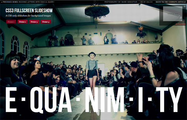
CSS3 technology is becoming increasingly popular, and things that are realized with its help, all the more impressive and exciting. Today a post about one of these methods. I was there very much impressed with the output image to full screen browser. In a sample of "epic" and large-scale high-quality HD images created a very cool effect. So recently came across a small network of CSS3 tutorial that allows you to place in the background of a slideshow of pictures on the screen, and with some animation.

CSS3 background slideshow tutorial

In addition, the page displays the title picture, and also with CSS. It looks very cool! Although the need to clarify that it will work only in browsers that support CSS animation. So there you go:

Page Layout

For our slideshow will use an unordered list, where each image tag adding Span, and the DIV will be available heading.

<ul class="cb-slideshow">      <li>          <span> Image 01 </ span>          <div>              <h3> re · lax · a · tion </ h3>          </ Div>      </ Li>      <li> <! - ... -> </ li>      <li> <! - ... -> </ li>  </ Ul>

For each element of Span will be a certain fixed background image (background image) for the slideshow.

CSS styles

First you need to set the styles for the list itself - it will be a fixed position, but stretched to the whole scope. Also used: after pseudo order to locate a picture (with effect) over the image:

.cb-slideshow,  .cb-slideshow:after {      position: fixed;      width: 100%;      height: 100%;      top: 0px;      left: 0px;      z-index: 0;  }  .cb-slideshow:after {      content: '';      background: transparent url(../images/pattern.png) repeat top left;  }

The code used by the repetition of style. Cb-slideshow with image effects for images, though you might as well try to place a gradient.

Span, containing the background image will be positioned absolutely and have a height and width of 100%. Since it is within the specific text, make transparent color as we do not want it to display. Background-size property with a value of cover will make sure that the background image cover the entire area of ​​the element, which in turn stretches the full width of the visible screen. Transparency is set to 0, this will be changed even when the animation.

. CB-Slideshow li Infinite linear 36s 0s ; }                                                                                                                  

The animation for each Span will last at least 36 seconds and run an infinite number of times. But first consider how to resolve the issue with the display headline:

. CB-Slideshow li Infinite linear 36s 0s ; } . CB-Slideshow li div H3 { font-family : 'BebasNeueRegular' , 'Arial Narrow' , Arial , sans-serif ; font-size : 240px ; padding : 0 ; line-height : 200px ; }                                                                                                                                                 

The animation for the header block will last 36 seconds.

Further, the CSS styles should be defined background images for each Span and delayed animation (animation delay) so that each of the following picture and caption appeared in 6 seconds after the previous one.

.cb-slideshow li:nth-child(1) span {      background-image: url(../images/1.jpg)  }  .cb-slideshow li:nth-child(2) span {      background-image: url(../images/2.jpg);      animation-delay: 6s;  }  .cb-slideshow li:nth-child(3) span {      background-image: url(../images/3.jpg);      animation-delay: 12s;  }  .cb-slideshow li:nth-child(4) span {      background-image: url(../images/4.jpg);      animation-delay: 18s;  }  .cb-slideshow li:nth-child(5) span {      background-image: url(../images/5.jpg);      animation-delay: 24s;  }  .cb-slideshow li:nth-child(6) span {      background-image: url(../images/6.jpg);      animation-delay: 30s;  }     .cb-slideshow li:nth-child(2) div {      animation-delay: 6s;  }  .cb-slideshow li:nth-child(3) div {      animation-delay: 12s;  }  .cb-slideshow li:nth-child(4) div {      animation-delay: 18s;  }  .cb-slideshow li:nth-child(5) div {      animation-delay: 24s;  }  .cb-slideshow li:nth-child(6) div {      animation-delay: 30s;  }

Now consider the animation process in more detail. Span elements set the animation 36 seconds. During this time, the transparency will vary from 0 to 1 when the animation reaches 8%. More transparency is preserved until we reach 17%. After 25% it should again be equal to zero and remain so until the end.

Where did these numbers? - Let's deal. We want to see each image was 6 seconds, besides, after passing through the whole cycle again, should be shown the first picture. Since the commonly used 6 images, for a total take 36 seconds. Now we need to set the appropriate values ​​of time for transparency. Given the fact that the second frame (picture) animation will start in 6 seconds, we need to know what percentile of the animation should be shown for the first picture. Divide 6 by 36 and get 0.166 ... that would be 16% for our step parameter keyframe.Now, since we do not want to order our image just disappear all the time, we define an intermediate step, which is equal to half of the previous value, that is 8%. The bottom line is that the picture seemed to completely disappear gradually after 17%, respectively, and completely disappeared by 25%. (Ed. - here, of course, have a little pomozgovat and deal with all the subtleties of animation and mathematical operations. If you want to use to use the code "as is" - just place it in style or make similar calculations).

@ Keyframes imageAnimation                                                                               

Similar calculations apply to animate the title, the only thing that make the Cape a little faster so that he disappeared, so the transparency of 0 to 19%.

@ Keyframes titleAnimation {       0%  { Opacity :  0  }       8%  { Opacity :  1  }       17%  { Opacity :  1  }       19%  { Opacity :  0  }       100%  { Opacity :  0  }   }

For all web browsers that do not support animation, we only show the last image slideshow by setting the transparency of the Span to 1.

. No-cssanimations  . CB-Slideshow li span {       Opacity :  1 ;   }

Finally you can take care of the font size when viewing area smaller. We will use the media queries in order to set the font smaller for certain values ​​of the width.

@ Media screen and (max-width: 1140px) {       . CB-Slideshow li div H3 {  font-size :  140px  }   }   @ Media screen and (max-width: 600px) {       . CB-Slideshow li div H3 {  font-size :  80px  }   }

Perhaps that's it for the simplest version of a slideshow with background images on the screen. While you can add something in the process of transition between pictures.

Alternative Animation

The following sample code, along with a change in image scale also adds a little twist:

@ Keyframes imageAnimation                                                                                                                        

The title should be "go" to the right (you need to change text-align blocks in the value of right), then get out of moving to the left with the effect of extinction:

@ Keyframes titleAnimation                                                                                                                                   

That is, in principle, and all. On this page you can find the demo (examples) of CSS3 effects. Experiment with different effects and animation for the titles and pictures. It should also be noted that at present the most beautiful and gently slide it will work in browsers with support for Webkit such as Chrome and especially Safari. On the other, alas, can be significantly slowdown, but overall impressions of this picture I think everyone will be good.

Read More →

Full page Background Image Resize from Css3

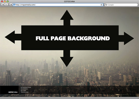
Web technologies, as well as various trends in design, do not stand still, so every time there's some new chips and nuances for the sites. One of these trends include the use of the background (backgorund), which is stretched to full screen width and height. Something like a year ago or more I'm told how to make a great backdrop for the site through CSS - Image placed in a hat blog and smoothly "passed" in the main background color of a web page.Placement on the background of a large scalable images - this is something new and more complex work, whose solution found in this article .

Background to site

The purpose of this lesson, place the background image on the site, which would permanently shut the entire background of the browser window. What exactly needs to be done:

  • fill the whole page with one image with no spaces;
  • resize images as needed (reduced browser window)
  • maintaining the image proportions;
  • location of the image in the center of the page;
  • no scroll bars on the page;
  • cross-browser solution, suitable for different browsers;
  • implementation without any third-party technologies such as flash.

Thus, there are several suitable solutions for the background site on the entire screen.

A wonderful, simple and innovative solution using CSS3

To realize the problem we can use the background-size property in CSS3. We use the html element that is a better body. Establish a fixed and centered background, after which we will use the background-size value of cover.

html {          background: url(images/bg.jpg) no-repeat center center fixed;          -webkit-background-size: cover;          -moz-background-size: cover;          -o-background-size: cover;          background-size: cover;  }

The solution supports almost all browsers are popular in the network:

  • Firefox 3.6 + (Firefox 4 supports non-vendor prefixed version)
  • Opera 10 + (Opera 9.5 supports background-size but not the values ​​of cover)
  • Chrome Whatever +
  • IE 9 +
  • Safari 3 +

Goltzman found a solution that allows you to work in IE hack

sizingMethod = 'scale') " ;               

But attention! while there may be some problems with the links on the page. By the way, a little later Matt Litherland added that the code is, in principle, can be used but this can not be used html or body elements and the need to implement all of a div with 100% width and height.

CSS -hack # 1

Is an alternate version of Doug Neiner. In this case, use the built-in page element <img>, which can be resized in any browser. Set the value of min-height, which helps to fill the browser window vertically and put a 100% width, which fills the page horizontally. Also set min-width so that the image has never been smaller than it actually is.

Next option is used to hack @ media to test whether your browser window smaller than the image and use the percentage of properties left and margin-left align image center.

img . bg  {           / * Set rules to fill Background * /           min-height :  100% ;           min-width :  1024px ;             / * Set up proportionate Scaling * /           width :  100% ;           height :  auto ;             / * Set up Positioning * /           position :  fixed ;           top :  0 ;           left :  0 ;   }     @ Media screen and (max-width: 1024px) {/ * Specific to this Particular * Image /           img . bg  {                   left :  50% ;                   margin-left :  -512px ;    / * 50% * /           }   }

Works in all versions of high-quality browser - Safari / Opera / Firefox and Chrome. For IE, as always has its own nuances:

  • IE 9 - works;
  • IE 7/8 - often functioning properly, but centers the image is smaller than the browser window;
  • IE 6 - can be customized, but who needs this browser.

CSS -hack version 2

Another variant of the solution by using CSS styles is to place the image inside the page with a fixed position in the upper left corner, then set the min-width and min-height to 100% while maintaining aspect ratio.

<img src="images/bg.jpg" id="bg" alt="">
# Bg  {           position : fixed ;           top : 0 ;           left : 0 ;              / * Preserve aspet Ratio * /           min-width : 100% ;           min-height : 100% ;   }

However, it is not possible to center the image, which, in principle, I would like to do. Therefore, we add an external image for the DIV. It is twice as large than the size of the browser window, and then the picture will keep the aspect ratio, close all your browser window and still be in the center.

<div id="bg">          <img src="images/bg.jpg" alt="">  </ Div>
#bg {          position:fixed;          top:-50%;          left:-50%;          width:200%;          height:200%;  }  #bg img {          position:absolute;          top:0;          left:0;          right:0;          bottom:0;          margin:auto;          min-width:50%;          min-height:50%;  }

Hack works:

  • Safari / Chrome / Firefox (very early versions were not tested, but in the latter works well)
  • IE 8 +
  • Opera (any version) and with both IE both are equally buggy with an error of positioning.

The method of jQuery

This option is much easier (in terms of CSS) if we know that the aspect ratio of the image (img is used as the background) is greater than or less than the current ratio of the browser window. If less, then we can only use the width = 100%, while the width and height of the window will be equally populated. If there are - you can specify only the height = 100% to fill the entire window.

Access to all data goes through JavaScript, use the following codes:

<img src="images/bg.jpg" id="bg" alt="">
# Bg  {  position :  fixed ;  top :  0 ;  left :  0 ;  }   . bgwidth  {  width :  100% ;  }   . bgheight  {  height :  100% ;  }
$ (Window). Load (function () {                 var theWindow = $ (window),              $ Bg = $ ("# bg"),              aspectRatio = $ bg.width () / $ bg.height ();             function resizeBg () {                     if ((theWindow.width () / theWindow.height ()) <aspectRatio) {                      $ Bg                          . RemoveClass ()                          . AddClass ('bgheight');                  } Else {                      $ Bg                          . RemoveClass ()                          . AddClass ('bgwidth');                  }             }             theWindow.resize (function () {                  resizeBg ();          }). Trigger ("resize");     });

In my opinion, centering in this case is not made ​​(as I understand it), but it can be done. Supports most desktop browsers, including IE7 +. Finally the author of articles about hacks prepared a set of sample files, which are all implemented - you can download it here . In comments to the original article, also contains some information and discussion, but most of the important details in the form author added apreytov to the post and I have it also translated and displayed. Of course, to understand all this help and examples. In general, if not permanent, "jokes" from IE7 all these hacks would be ideal.

PS Bzauzery - the main tool for the user on the Internet, and the best firefox plugins to help make it as convenient, fast with new features and capabilities. 

Want to buy a book? - Not necessarily go to the store because it is now online bookstore online store allows you to do everything over the network - to select, pay and arrange delivery to your home.

Read More →